
افکت پروانه
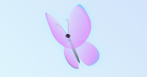
با استفاده از کدهای زیر می توانید، افکت پروانه را در سایت خود اجرا نمایید.
<!DOCTYPE html>
<html>
<head>
    <title>Background Pattern 1</title>
    <link rel="stylesheet" type="text/css" href="style.css">
</head>

<div class="container">
<div class="butterfly">
  <div class="body"></div>
  <div class="head"></div>
  <div class="wings left">
    <div class="top"></div>
    <div class="bottom"></div>
  </div>
  <div class="wings right">
    <div class="top"></div>
    <div class="bottom"></div>
  </div>
</div>
</div>
</html>
* {
  margin: 0;
  padding: 0;
  box-sizing: border-box;
}

.container {
  display: flex;
  align-items: center;
  justify-content: center;
  height: 100vh;
  background: linear-gradient(
    45deg,
    rgba(112, 242, 245, 0.2),
    rgba(11, 87, 230, 0.2)
  );
  /* position: relative; */
}

.butterfly {
  position: relative;
  display: flex;
  justify-content: center;
  align-items: center;
  width: 400px;
  height: 400px;
  /* border: 1px solid black; */
  perspective: 400px;
  transform-style: preserve-3d;
  transform: rotate3d(1, 2, -1, 45deg);
}

.body {
  position: absolute;
  width: 20px;
  height: 150px;
  background: linear-gradient(45deg, rgba(0, 0, 0, 0.57), rgba(0, 0, 0, 0.14));
  border-radius: 50%;
  /* transform: rotate3d(2,2,-1, 15deg); */
}

.head {
  position: absolute;
  top: 120px;
  left: 185px;
  width: 30px;
  height: 20px;
  background-color: black;
  border-radius: 50%;
}

.body::after {
  content: "";
  position: absolute;
  top: -70px;
  left: -20px;
  width: 20px;
  height: 90px;
  border: 2px solid lightslategray;
  border-radius: 100% 50%;
  border-left: none;
  border-bottom: none;
  transform: rotate(-25deg);
}

.body::before {
  content: "";
  position: absolute;
  top: -85px;
  left: 10px;
  width: 20px;
  height: 100px;
  border: 2px solid lightslategray;
  border-radius:100% 50%;
  border-left: none;
  border-bottom: none;
  transform: rotate(25deg);
}

.left .top {
  position: absolute;
  top: 20px;
  left: 80px;
  width: 30%;
  height: 45%;
  background: linear-gradient(
    45deg,
    rgba(242, 66, 248, 0.6),
    rgba(255, 255, 255, 0.3)
  );

  border-radius: 15% 85% 0% 100% / 57% 84% 16% 43%;
  box-shadow: inset 15px 14px 2px -16px rgba(150, 189, 240, 0.549),
    inset 15px 8px 8px -6px rgba(228, 107, 252, 0.3);
  filter: drop-shadow(1px 1px 15px rgba(20, 250, 250, 0.3));
  /* transform: rotate3d(2,2,-1, 45deg); */
  transform-origin: right;
  animation: left 4s ease-in-out infinite;
}
.left .bottom {
  position: absolute;
  bottom: 100px;
  left: 100px;
  width: 25%;
  height: 35%;
  box-shadow: inset 15px -14px 2px -8px rgba(12, 142, 65, 0.2);
  background: linear-gradient(
    45deg,
    rgba(242, 66, 248, 0.6),
    rgba(255, 255, 255, 0.29)
  );
  border-radius: 100% 0% 35% 65% / 60% 6% 94% 40%;
  filter: drop-shadow(1px 1px 15px rgba(20, 250, 250, 0.3));
  transform-origin: right;
  animation: left 4s ease-in-out infinite;
}

.right .bottom {
  position: absolute;
  bottom: 100px;
  width: 25%;
  height: 35%;
  overflow: hidden;
  box-shadow: inset -15px -14px 2px -8px rgba(20, 250, 250, 0.2);
  /* border: 3px solid green; */
  /* border-left: none; */
  /* border-bottom: none; */
  background: linear-gradient(
    -45deg,
    rgba(242, 66, 248, 0.6),
    rgba(255, 255, 255, 0.3)
  );
  border-radius: 0% 100% 60% 40% / 6% 65% 35% 94%;
  filter: drop-shadow(1px 1px 15px rgba(20, 250, 250, 0.3));
  animation: right 4s ease-in-out infinite;
  transform-origin: left;
  z-index: 1;
}

.right .top {
  position: absolute;
  top: 20px;
  /* left: 0; */
  width: 30%;
  height: 45%;
  filter: drop-shadow(1px 1px 15px rgba(20, 250, 250, 0.3));
  background: linear-gradient(
    -45deg,
    rgba(242, 66, 248, 0.6),
    rgba(255, 255, 255, 0.3)
  );
  border-radius: 85% 15% 100% 0% / 84% 43% 57% 16%;
  box-shadow: inset -15px 14px 2px -16px rgba(20, 250, 250, 0.549),
    inset -15px 8px 8px -6px rgba(228, 107, 252, 0.3);
  animation: right 4s ease-in-out infinite;
  transform-origin: left;
  z-index: 10;
}

@keyframes left {
  0% {
    transform: rotate3d(0, 1, 0, 80deg);
  }
  70% {
    transform: rotate3d(0, 1, 0, 20deg);
  }
  100% {
    transform: rotate3d(0, 1, 0, 80deg);
  }
}
@keyframes right {
  0% {
    transform: rotate3d(0, 1, 0, -80deg);
  }
  70% {
    transform: rotate3d(0, 1, 0, -20deg);
  }
  100% {
    transform: rotate3d(0, 1, 0, -80deg);
  }
}